 Celer Docs
Customizing Lines
You can add extra properties to the line by specifying it in the following format:
- Example Section:
  - Get the weapon:
      comment: In a chest
      icon: chest
      notes: Under the rock
Here, Get the weapon is the primary text of the line. The mapping under it contains the customization for comment, icon and notes.
The rest of this page lists all available properties.
Primary and Secondary Text
The following properties are used for text customization:
| Property | Type | Description |
|---|---|---|
comment | Rich Text | Secondary text. This text will appear below the primary text in a smaller font |
text | Rich Text | Override the primary text. Presets specified here will NOT be expanded |
Example:
- Example Section:
  - Do the thing:
      comment: be fast
Notes
The notes property can be used for adding notes that appear on the side.
| Property | Type | Description |
|---|---|---|
notes | Rich Text | Set a text note to appear on the side |
You can also specify an array instead of a single note.
Example:
- Example Section:
  - One Note:
      notes: bala bala
  - Many Notes:
      notes:
      - if you can't do it you can do the backup
      - if you fail the backup you can do the other backup
Banner
You can use the banner property to make a line extend to cover the notes panel
| Property | Type | Description |
|---|---|---|
banner | true or false | Make a line a banner |
Example:
- Example Section:
  - This is a normal line
  - This is a banner line:
      banner: true
Counter
This property can be used to customize the counter block.
| Property | Type | Description |
|---|---|---|
counter | Rich Text | Set the text and style for the counter block on the left of the main column |
WARNING
The Rich Text style is applied to the whole block. This means you can only have one tag like .tag(hello) or hello (no tag)
Icon
You can configure the icon by using the icon-* properties:
| Property | Type | Description |
|---|---|---|
icon-doc | string | Icon ID of the icon on the document |
icon-map | string | Icon ID of the icon on the map |
icon-priority | 0, 1 or 2 | Set the priority/level of the icon. |
When setting priority, 0 is primary, 1 is secondary, and other values are "other". If not set, the default priority is 2 and can be configured. See Configuration for more details.
Example:
- Only icon on the map:
    icon-map: shrine
- icon on the map with priority:
    icon-map: temple
    icon-priority: 1
- icon only on the doc:
    icon-doc: chest
- different icons on doc/map:
    icon-doc: chest
    icon-map: shrine
If you are setting the same icon on both doc and map (which is very common), you can use the icon shorthand:
- specify both doc and map with default priority:
    icon: shrine
# above and below are the same
- specify both doc and map with default priority:
    icon-doc: shrine
    icon-map: shrine

# you can also use the shorthand and `icon-priority`
- specify both doc and map icon with priority 0:
    icon: shrine
    icon-priority: 0
You can also change an icon from a preset:
- _SomePresetWithIcon:
    icon: shrine     # override the icon on both doc and map
- _SomePresetWithIcon:
    icon-doc: shrine # only override the icon on the doc
- _SomePresetWithIcon:
    icon-map: null   # hide the icon on the map, `""`, `false` also work
Color
Use the color property to change the line color, both on the map and on the document. The current line will have the new color, and lines afterward will keep this color until changed again.
The color is interpreted as a CSS color.
| Property | Type | Description |
|---|---|---|
color | string | Change the line color |
TIP
You can temporarily override the color on the map by using the color property under movements property
Examples:
- Example Section:
  - Change to red:
      color: red
  - Change to orange:
      color: "#ff8800"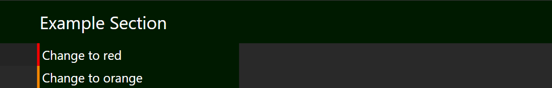
Markers
Use the markers property to add circular markers.
| Property | Type | Description |
|---|---|---|
markers | sequence | A list of markers. Each marker should have the at property and optionally a color property. |
The at property is required, and should be a valid Route Coord with 2 or 3 axes specified.
The color property is optional, and the default is the same color as the line
Examples:
- Markers example:
    markers:
    - at: [0, 0]
    - at: [1, 2, 3]
      color: red
Movements
Movements are customized with the movements property. See Customizing Movements for more details.
Split Name
Use this property to set the split name.
| Property | Type | Description |
|---|---|---|
split-name | Rich Text | Name to be used when exporting to compatible software, such as livesplit |
TIP
You can use Rich Text for the split name so that plugins can alter it if necessary. When exporting, the style provided by the Rich Text is usually not kept.
If not specified, the primary text will be the split name.
Presets
The presets property allow you to define additional presets for the line. See Using Presets for details.
Other Properties
If you are using Plugins. You may be able to specify additional properties. Please refer to the documentation for the plugin you are using.
If you specify a property that is not recognized by Celer or any plugin, you will see a warning message saying that property is unused.